UX/UI
Data Visualization

California Wildfires: 2015 v 2020
Exploring how to gather data from primary sources and then organizing said data to create representational graphics. I focused on comparing California Wildfires in 2015 to 2020.

COVID-19 Cases v Hospital Beds in the U.S
~ as of Dec. 7, 2020 ~
Exploring how to gather data from primary sources and then organizing said data to create representational graphics. I focused on comparing COVID-19 cases and hospital beds in the United States.
Prototypes
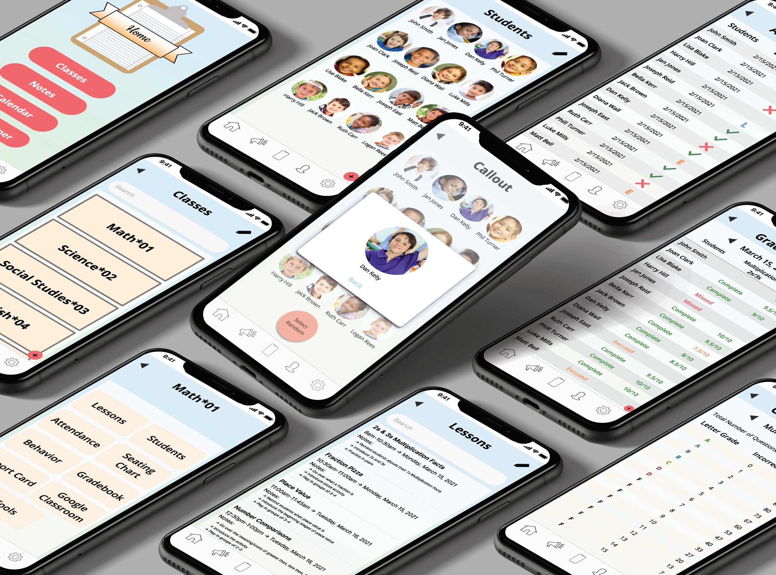
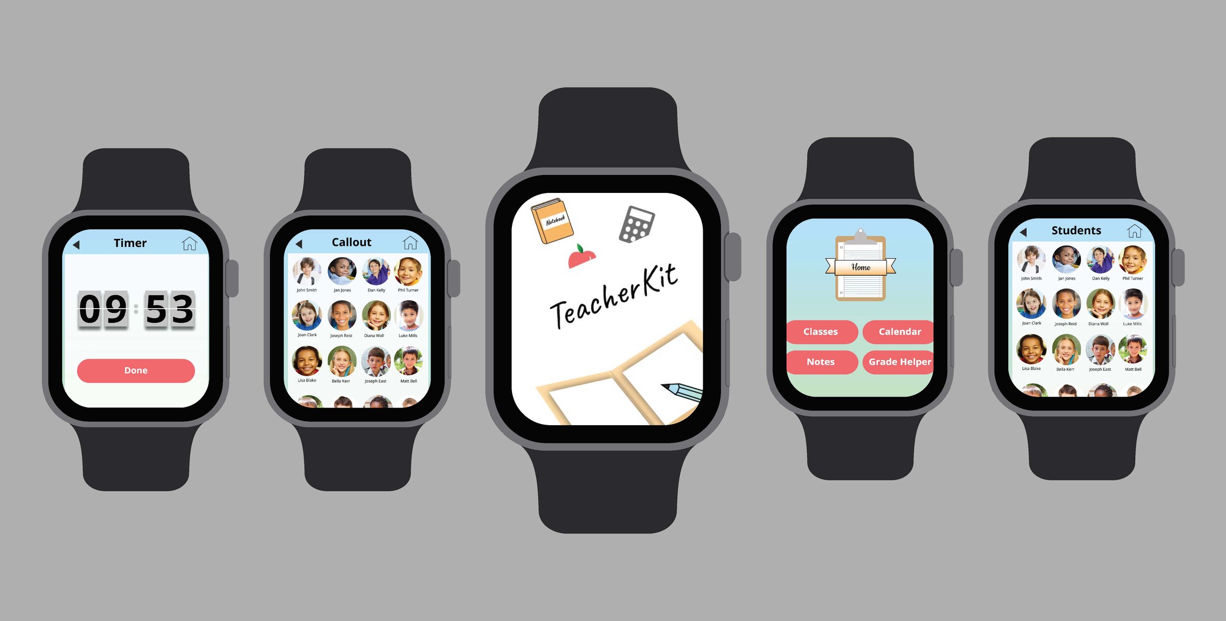
TeacherKit Prototype
Searching the world of UX and UI design one prototype at a time. First up is the redesign of TeacherKit. This project combined my two passions, teaching, and designing. TeacherKit is an application designed for teachers to create a seating chart, record attendance, log behavior, and track grades. The idea of the application is great, however, the design of the app was a disaster. That is where I came in.

Unruffled Prototype
I decided on redesigning a self-care app called Aloe Bud. I thought while redesigning the layout it needed a new name, so I renamed it Unruffled. This was a fun application to redesign because I was able to have creative freedom to completely change the content inside the app to make it better.
Website Design

Sustainable Food Festival
For this project, I designed a website prototype for a cause. The cause I chose was the Environmental Defense Fund (EDF) and decided on raising money for them by hosting a food festival. All the food festival vendors listed on the website will have eco-friendly packaging so customers don’t have to worry about waste.